Belleville Dental Care
A technology-driven practice wanting to stand out from the stereotypical dental experience.
Since working with us:
Launched new brand identity and website with great success
Sold practice for undisclosed amount

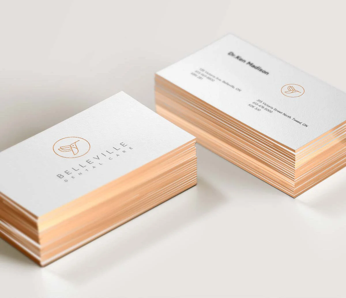
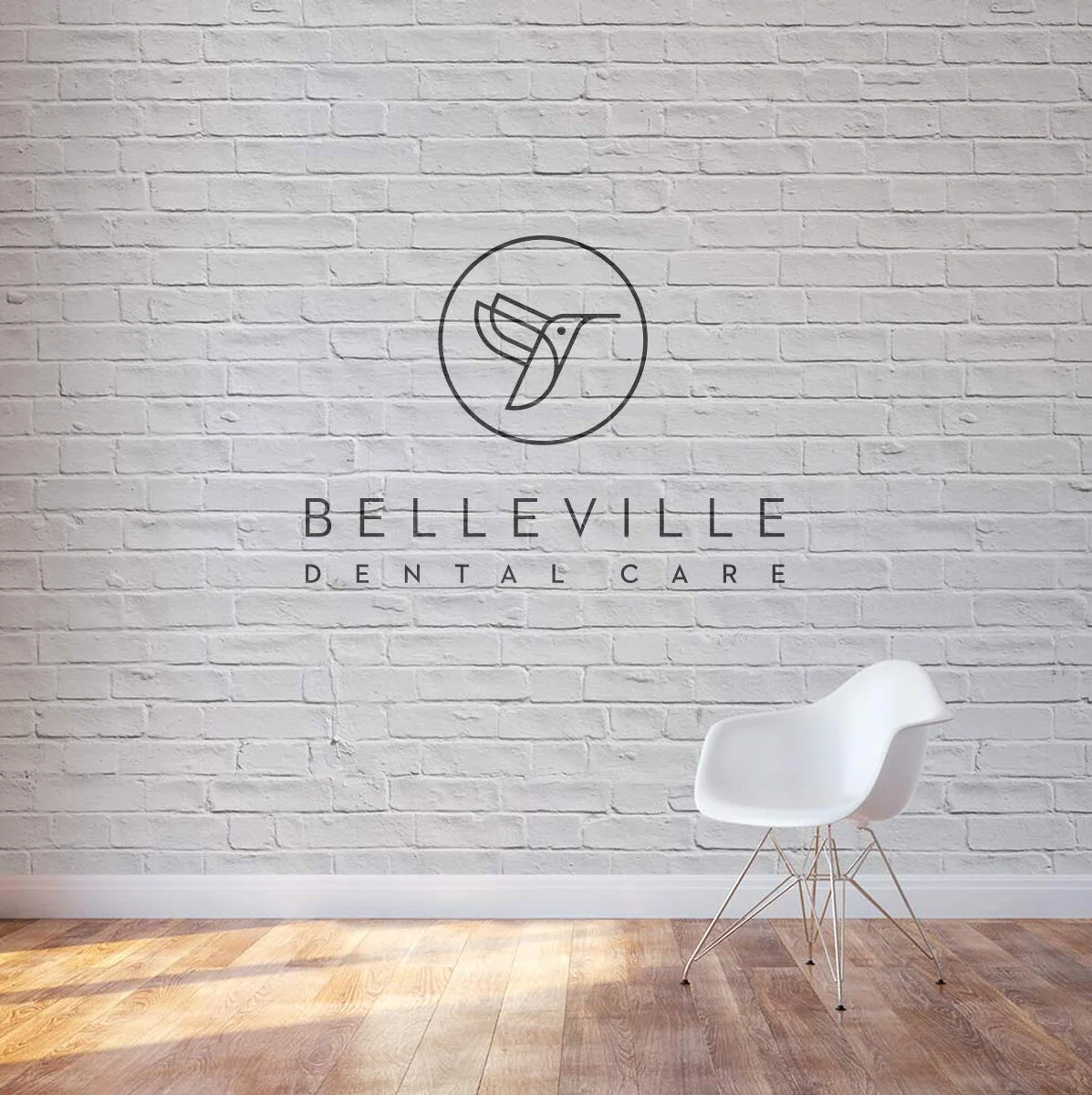
When you think of a standard dental practice logo, you likely think of a tooth or a smile. For Belleville Dental Care, we scrapped common dental references and sought a symbol that was more nuanced. Seeking commonalities between shapes found in both dental equipment and nature, we ultimately landed on the hummingbird, which looks like a cleaning tool in shape, but represents love and happiness.


For colors, we made a conscious choice to choose a palette that was clean and inviting. We also stayed away from yellow tones (only bleached pearly whites here!) so any white backgrounds in the brand really popped. Drawing inspiration from tech-leaning brands, we opted for an elegant peach, soft metallic, and charcoal color palette, which ensures sophistication in every visual representation.


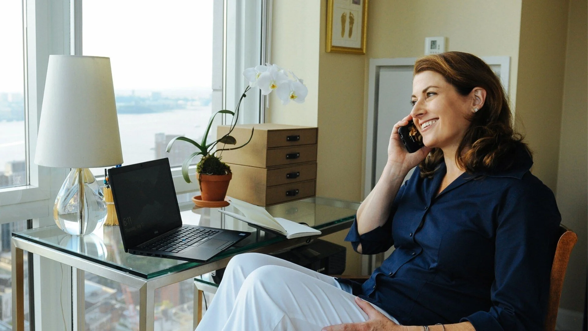
When patients visit their practice, they’re exposed to the most cutting-edge dental technology on the market. Examples of the brand’s execution are clean and forward-thinking, almost like visiting the Apple store.

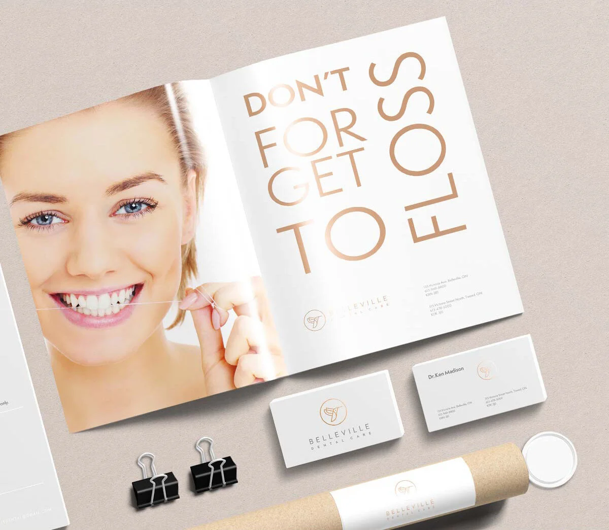


For the website, we kept things simple. Belleville Dental Care’s team is professional and casual, and we wrote in a tone that reflects their hospitality.

Now, years later, Belleville Dental Care successfully sold their practice, and its owners were able to retire to enjoy the life they deserve. We suspect that the new brand helped communicate the value of this practice, and we hope that the brand makes people smile.
Position
We kick off relationships with a 90-minute brand audit. We analyze what’s working and what isn’t, then deliver a detailed recap with actionable advice.
Build
After the audit, we develop your brand identity, organize lifestyle photography, produce standout brand assets, and design a Squarespace site to bring your brand to life.
Promote
From growing your audience to landing press and speaking gigs, we help you get seen. Through strategy sessions or our group program, we’ll help you achieve your brand goals.
Related projects
Since 2011, Phil Pallen Collective has built brands and online presences for experts and companies in nearly every industry imaginable.