Carrie Cook
A media mastermind who pushes companies beyond their creative potential.
While working with us:
Created a title to encapsulate her unique profession
Developed an intricate brand identity rooted in storytelling
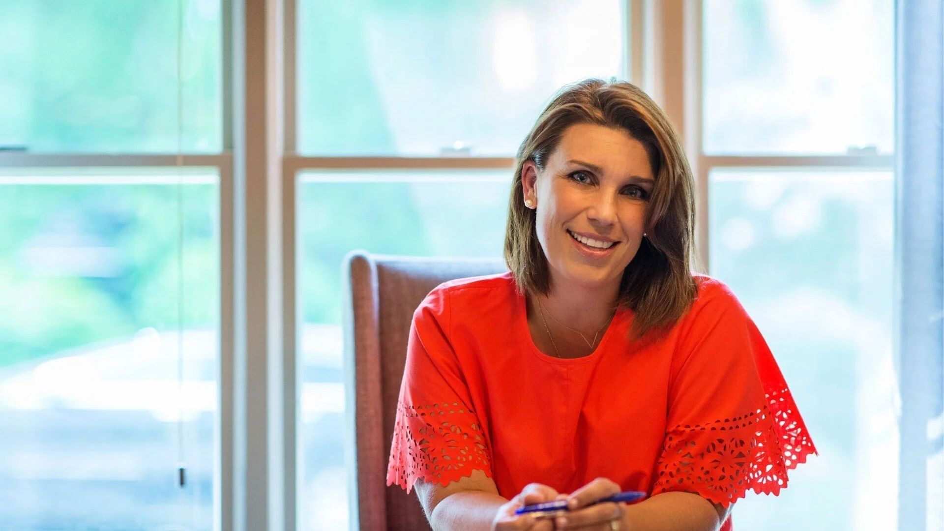
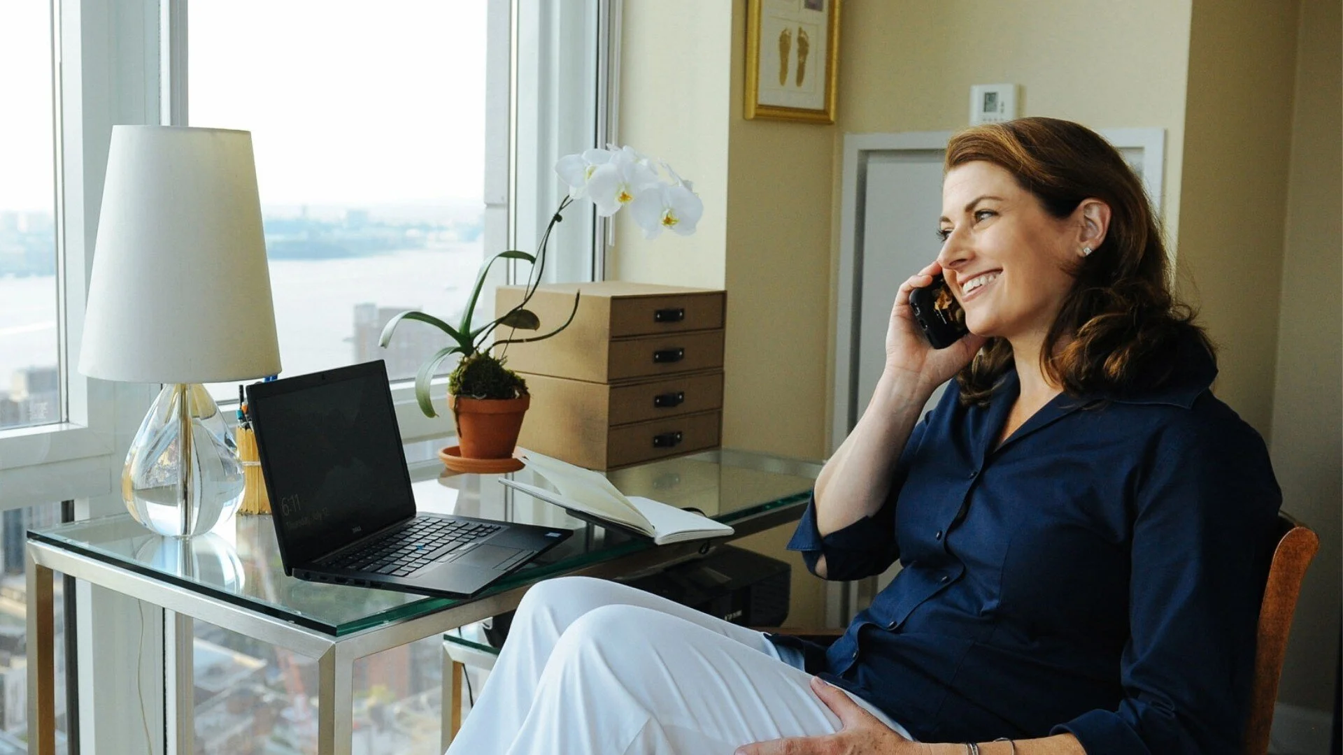
Oversaw photo creative direction for powerful images
Carrie is the brains behind America’s most memorable campaigns—The Opposite of Loneliness, Healthy Child Healthy World, and Sal Khan’s partnership with Bank of America—and she needed a brand to showcase her creativity and authority.


Carrie Cook is many things: a creative who makes things happen, an advertiser with soul, a strategist who thrives in the unknown, and a producer who focus on possibilities. With so many accomplishments and skills, we decided to call Carrie a media navigator and used symbols related to the sea (direction, momentum, anchors) as the foundation of her brand’s theme.
To showcase Carrie’s creativity, we created an illustrated, organic logo with a whimsical color scheme.


Photography by Lisa L

Her vast portfolio of projects include bringing brands to television, turning concepts into books, and helping to develop brand personalities across multiple platforms. During our brand audit session, we created this brand sentence for Carrie:
Brand sentence
A media navigator who turns ideas into successful projects.
For photography, we placed Carrie in inspiring environments—surrounded by books, her awards, past accomplishments, and historical architecture. The result was a visual experience that captures what it’s like to work with Carrie: invigorating, comfortable, and unexpected.


Now equipped with a brand that clarifies her immense value for organizations, Carrie is continuing to take on NYC’s media by storm.
“Made me focus on what my superpower was.”
“The process was like brand therapy. It really made me focus on what my superpower was and Phil’s guidance helped me understand how to talk about it.”
Carrie Cook
Position
We kick off relationships with a 90-minute brand audit. We analyze what’s working and what isn’t, then deliver a detailed recap with actionable advice.
Build
After the audit, we develop your brand identity, organize lifestyle photography, produce standout brand assets, and design a Squarespace site to bring your brand to life.
Promote
From growing your audience to landing press and speaking gigs, we help you get seen. Through strategy sessions or our group program, we’ll help you achieve your brand goals.
Related projects
Since 2011, Phil Pallen Collective has built brands and online presences for experts and companies in nearly every industry imaginable.


